Having just read the book The Widow Clicquot this post is dedicated to the instantly recognizable golden orange color of her label.

Back in the widow’s day, champagne bottles did not wear the advertising labels that we now know. The bottles looked very similar with subtle markings on the corks distinguishing the various brands. Once labels came into the picture, orange was an excellent choice for making the brand stand out.

Orange gets noticed.

Casa V logo designed by Scott Wallin.
Tory Burch chose her favorite color for her logo. Hermes’ boxes are recognizable as the ultimate status symbol. My own company logo makes use of this stimulating shade. My graphic designer urged me to use bright colors, but I resisted preferring the greyed greens and blues commonly used in my projects. When updating my website, I decided to take his advice. My logo is the same, but now the colors are shades of citrus. My orange yard signs pop against messy job sites. Last year client Christmas gifts of homemade jams wore bright labels the color of Veuve Clicquot.


Tory Burch’s Manhattan apartment. (Photo: Francois Halard)
While orange is wonderful on a bottle of champagne or a business logo, it can be tricky for an interior.
Only the bold dare to color their homes in this vibrant shade.

East side townhouse by Katie Ridder. (Photo: katieridder.com)

Carnegie Hill home by Katie Ridder. (Photo: katieridder.com)
Katie Ridder is the queen of color. She regularly incorporates orange into her projects. Sometimes it is the main color. Other times it is used as an accent.

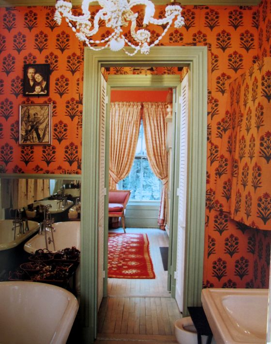
Her bathroom at one point. (Photo: The World of Muriel Brandolini, Rizzoli.)

(Photo: jennyandrewsanderson.com)
Muriel Brandolini is also fearless in her use of color. She paired one of her Indian flower fabrics with mint green trim in her personal bathroom. The combination was so good that she repeated it in the room above. Orange lacquered walls with avocado trim.
Special fabrics can be used for just a flamboyant splash.

Stella by Tulu Textiles.
If you are interested in adding some orange without the full room commitment, these textiles could be useful.

C&C Milano makes this lovely ikat stripe that tones down the hue with off white. This is a timeless fabric that could work in any number of interiors.

One of my clients loves orange but wanted a primarily neutral color scheme in her home. We added just a touch of color by upholstering these striking chairs with a neutral and orange stripe.
This earthy color is commonly used in the Southwest, but use it creatively to keep it fresh.

Guest house entry by Casa V Interiors. (Photo: Alex Leyton)
Orange was a natural choice for this Tucson house that I designed years ago.

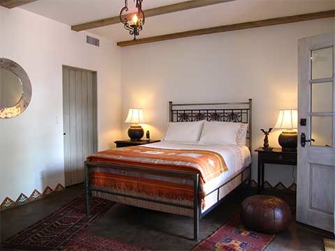
Guest house by Casa V Interiors. (Photo: Alex Leyton)
This zippy color is present in the guest room in varying hues from the vibrant shade of the Moroccan rug used as a bedcover to the subtle terracotta baseboard tiles.

Tucson living room by Casa V Interiors. (Photo: Alex Leyton)
The living room of the same house features the color again in Fortuny pillows, a kilim-upholstered bench, another kilim on the floor, and more subtly in the Imari lamp.

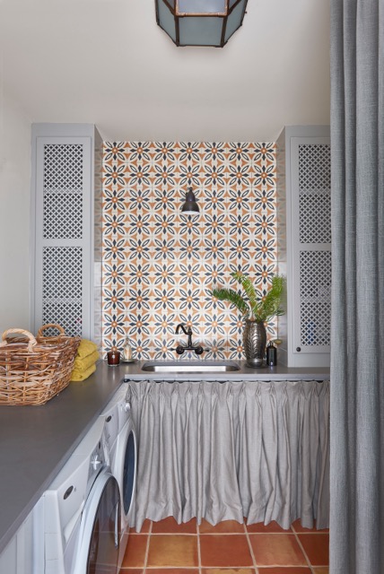
Winter Park laundry room by Casa V Interiors. (Photo: Stephen Allen)
Tangerine highlights in the cement tile contrast nicely with the overall grey scheme of this Winter Park laundry room.
Orange is the color of fall and pumpkins, appropriate for Thanksgiving Day today. Also for that bottle of “the widow” which makes our next season so celebratory. Enjoy your holiday today with those you love.
Casa V Interiors will add a touch (or more) of the color Clicquot to your home for a dose of joy.
